Design Vision
What is it?
A vision to guide the product design direction. It’s part strategic direction, part a set of principles, part guidelines for using those principals, and examples of how design can accomplish those goals.
My Role
I created the vision working with the XD, PM and PD teams as stakeholders. When completed, I rolled it out to the Product organization.

When taking over and building a team, the entire organization needed a vision for where design was going, and principles to guide strategy and decisions. I identified these key problem areas:
~ Not consistent with the Quick Base brand
~ Not in step with modern design standards or user interactions
~ Not internally consistent
~ Incomplete across devices
~ Difficult to get started
~ Too many workarounds are needed
~ Difficult to use, with too many clicks
The challenge was to create a vision that was compelling, evergreen, and directional, yet non-prescriptive enough to give designers freedom to explore and re-imagine.

These three high-level principles guide the design vision. each is broken down into specific guidelines and examples.

Before beginning the project of defining the vision, our Product team collectively determined what we all believed were the goals of a vision: What it needed to accomplish. What it needed to include. What the balance between principle and specification should be.

Employ common mobile and web interactions and standards wherever possible. The more people leverage what they already know the less they have to learn.

Through visual presentation and drag ‘n drop calendars support the principle’s guidelines of ‘Use UI/UX standards’, ‘Visual over textual’, and ‘Direct manipulation.’

Clean, crisp, to the point. Get clutter out of the way.
Use our experience and expertise to make the right decisions for our users… don’t put our responsibility to make great choices onto their shoulders.

A small but telling example. Previously builders had to write complex formulas to colorize records based on different criteria. Our design of a simple color picker based on choices in a text field handles 80% of the cases. Formulas are still available for more complex colorization.

Rich tools must support learning over a long time period. Users grow in their understanding and knowledge, and at each stage, different types of guidance and help are needed.

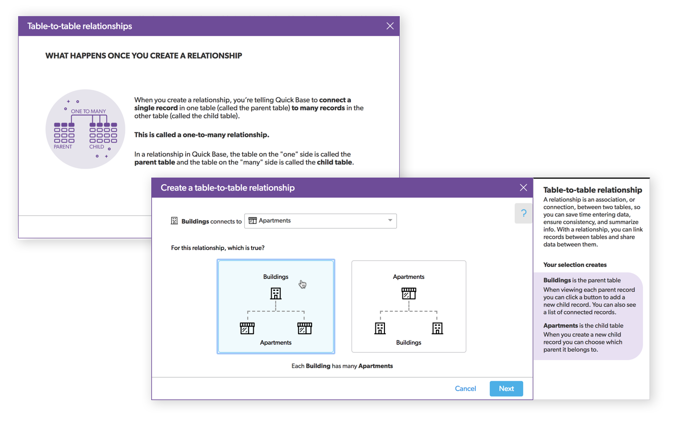
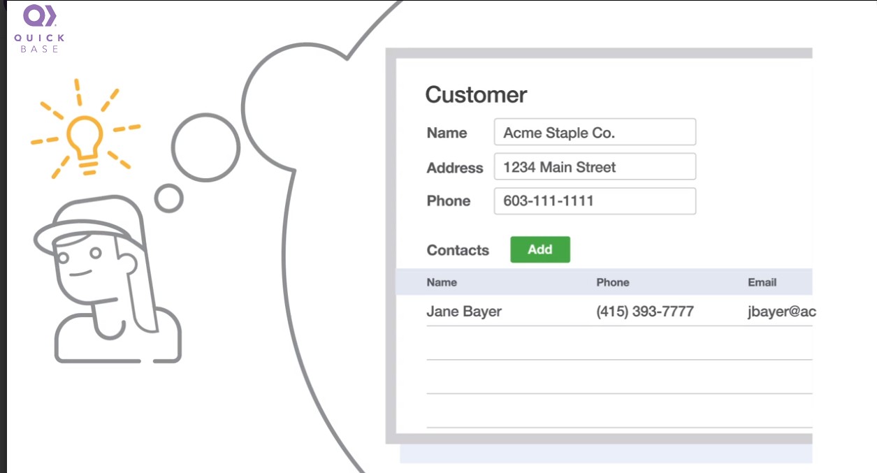
A key distinction between spreadsheets and databases is the ability to relate records in different table of data. This is powerful, but the concept is new to most people used to managing data in spreadsheets only.
The in-context guidance, using illustrations and plain English, informs and trains builders as they use this feature. And of course, the help text can be hidden when no longer needed.

The Design Vision drove creation of these three core elements of UI design and development. As the design and development organizations grow these are fundamental to rapid development of exceptional user experiences.

Prior to this each team created code that could be copied be not reused and extended. A major effort of the design vision was to create a reusable component library, the first in Quick Base history.

The Design Vision principles and guidelines are used as a reference for all design and development work.
The Pattern Library and Style Guide keeps all designers in sync with product standards when they need to solve a new problem.
The Component Library speeds development time and insures consistent user experience through reusable elements.


